


When you start looking for the perfect interior design for your home, you will have to think about the perfect color as well. A perfect color choice has the potential to change the look and feel of a room just by itself. That is why you need to consider this factor while finalizing interior design options.
Before choosing the ideal color for your interior space, you must keep certain things in minds such as the color theory, color scheme, tips and trends. To ensure these factors don’t go unnoticed, and you do not end up making a mistake with your choices, we have listed determining factors that will help you finalize a color for your interiors.

What is color theory?
If you have an interest in interior designing then knowing some basics about color theory is very important. Most people do not understand the colors as the interior designers do and that’s perfectly fine. However, knowing about the color basics makes you take the right decisions when you are designing your home or office. Let’s explore the color basics and the theory of color.
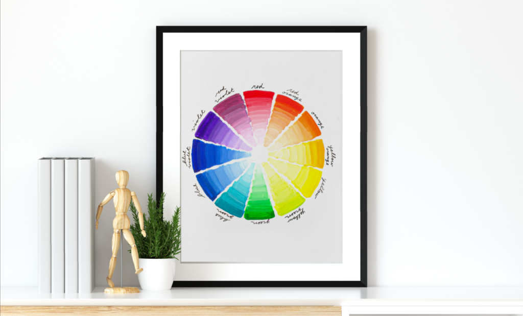
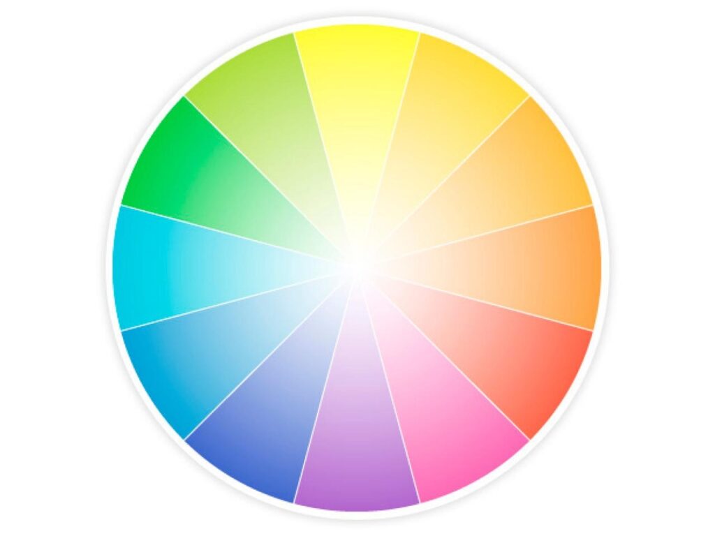
In a simple definition, color theory is the art of blending colors based on the color wheel, an organized representation of the primary, secondary, and tertiary hues. Designers, artists and brand owners use this color wheel to understand how different colors relate and go well with others to improve the color palette being used, be it in an interior space or artwork. Here is how color theory comes to your aid when you are remodeling or sprucing up your home through a color palette.

Using the Color Wheel
The color wheel gives a visual idea about colors and which among them blend well together. Most models of color wheels have 12 essential colors while others may have infinite shades. You need not remember all the colors as there are websites like Paletton to help you create color by using a computer. There is also an app called ColorSchemer, which offers the same features for the user of iPhone.
Knowing the Basic Colors
The primary colors are red, yellow and blue. These are colors that cannot be made by mixing other colors. The secondary colors are orange, green and purple which are colors that can be formed by mixing the primary colors. Then comes the tertiary colors which are six shades that can be made by mixing primary and secondary colors.

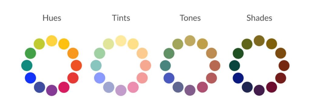
Changing Colors with Neutrals
When you select the basic color, it is easy to create various types of the same family. You just need to combine a neutral color to form light to dark tones of color. In interior design, this is known as tint, shade and tone. Tint refers to lighting color by adding white color to it. Shade refers to the darkening of a color by adding black to it. Tone refers to slightly darkening the color by adding a grey color.
Knowing the Color Temperature
You must have heard people explaining colors with temperature references like warm or cool colors. Red, yellow and orange are usually described as warm colors whereas blue, green and purple are called cool colors. The warmer ones are more vibrant while the cooler ones impart a relaxed feel.

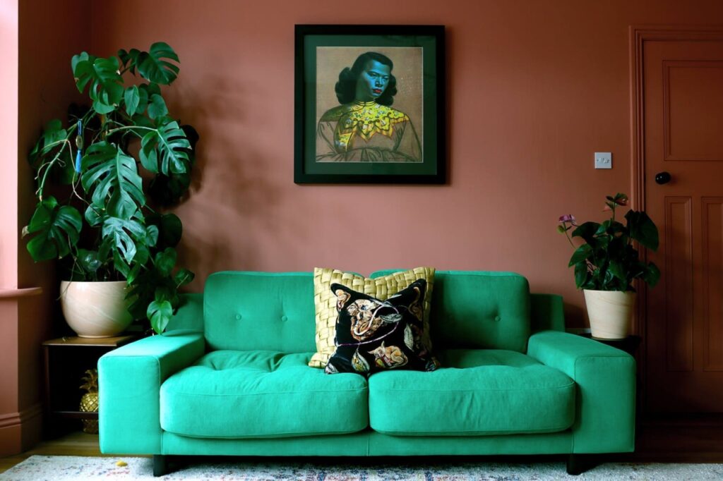
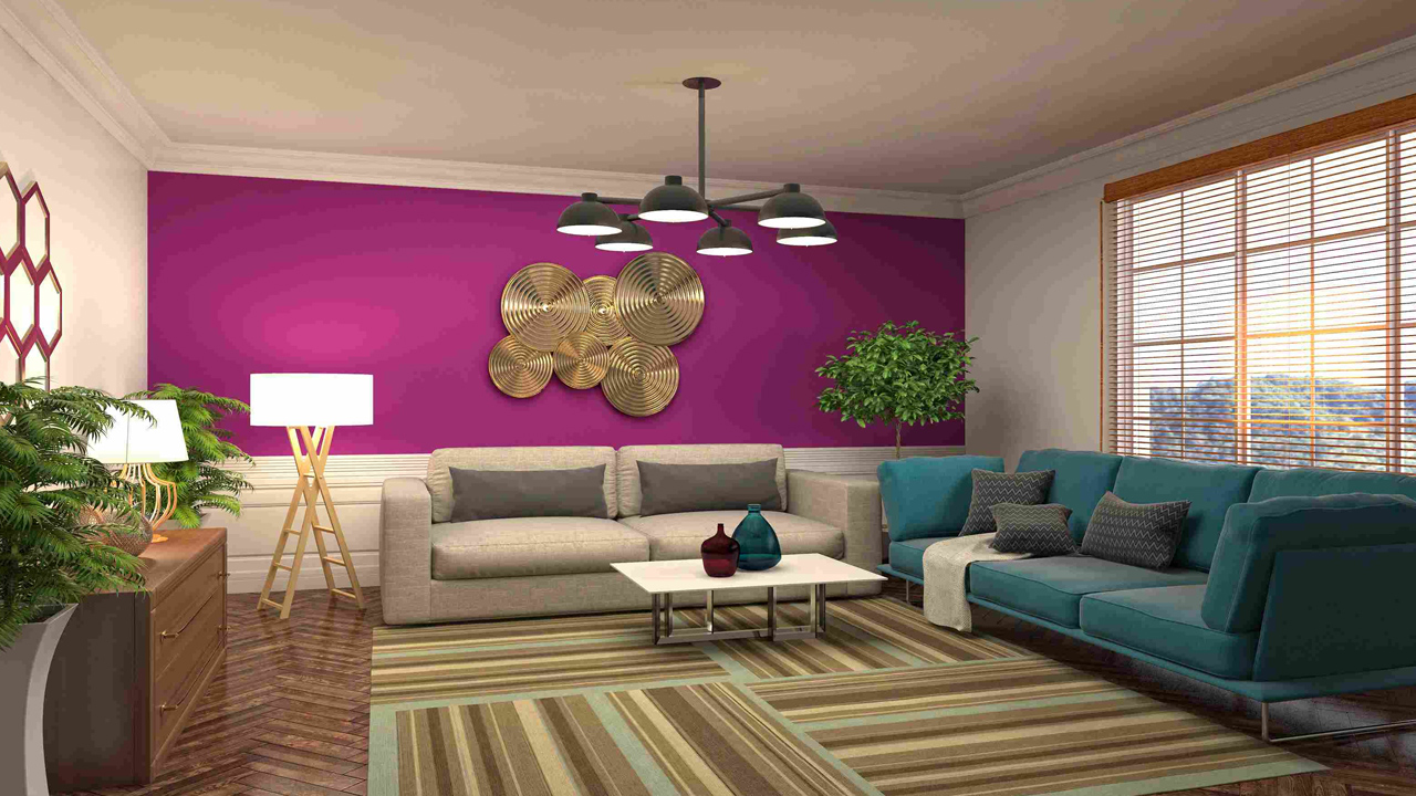
Complementary Color Scheme
This refers to the process where two opposite colors on the color wheel are used for the interiors. While one color acts as the dominant shade the other acts as an accent. This gives birth to aesthetically powerful color combinations that create a sense of self in space. Such combinations are used to draw attention to a particular design element. It must be remembered that when such color schemes are used, they must be backed by neutral colors.
Split-Complementary Color Scheme
This is a comparatively safer choice than the complementary color scheme which many people might not find interesting to use. In this, you have to choose two secondary shades and one base color. You will need to pick two colors placed symmetrically around a complementary color on the color wheel. Use the base color as the main element while using the secondary colors to highlight and accent. It will offer balance to the room décor.
Analogous Color Scheme
This refers to using three colors in a row on the color wheel. Mostly, two colors will be primary colors while the third color is a mix of two and a secondary color. The main key point of using this color scheme is to strike the right proportion. For this 60-30-10 rule comes into play. The first color is used as the dominant shade, the second supports the dominant and the third color is the most vibrant and used as an accent.

Triadic Color Scheme
This color scheme refers to using three colors on the color wheel with equal space between them. The three primary colors and three secondary colors are the right examples of a triadic color scheme.
Tetradic Color Scheme
This refers to balancing four colors in the given space. This color scheme is also sometimes known as a rectangle scheme owing to the shape it makes on the color wheel. Choosing two warm colors and two cool colors is the best for this kind of scheme.
Square Color Scheme
It is quite similar to a tetradic or rectangular color scheme. This also uses four shades but in place of focusing on opposing pairs, the scheme focuses on colors that are evenly spaced. Irrespective of the color that is used, the scheme involves one primary, one secondary and two tertiary colors.
How to Choose a Perfect Color Scheme?
The right kind of color scheme for the interiors can entirely change the look and feel of any space. Therefore, you must know how to choose the perfect color palette to imbibe your home. First, you need to find inspiration, which can come from some artwork or even natural scenes.
You also need to consider the color value, which refers to the darkness or lightness of the hue. A mix of values helps you save from the chaos of colors in the end result. Go for one dark, one light and one bright color for every room.
You also need to carefully plan your home’s overall color order. Draw a plan for your home and list what goes where. You need to see what color furniture will be used and ensure that it goes well with the colors you are picking for the interiors. Consider how light affects colors. Daylight and artificial illumination will give you varying results for any particular color and therefore it becomes an important point to consider.
Consider Lights
Among different forms of light, daylight is the one that has consistent intensity given over the entire visible spectrum of colors. You need to observe how natural lighting and artificial lighting affect the color of wall paint, textiles, furniture and other surfaces indoors. As we all know that color is a reflection of light, the kind of light, its type and intensity will influence your overall color palette.
If you consider artificial lighting, incandescent light renders warmer and reddish light as compared to natural sunlight. On the contrary, fluorescent light produces cooler and bluish light. Any color with white in it will obviously reflect the colors around it. The purest colors are the ones found during the daytime. When you are going to select a color palette, it is important to understand that different kinds of lighting will change the look and feel of individual colors.
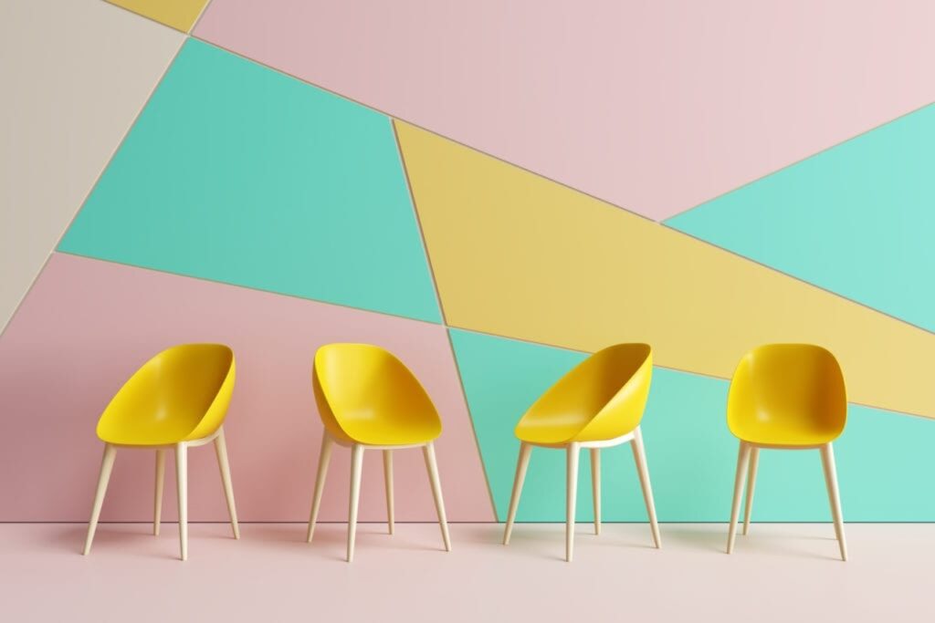
Color Groupings to Explore
There are some good examples of color combinations that are popular and give great results when it comes to interiors. Here is the list of some of these groupings:
- Blue + Beige
- Hunter Green + Red
- Blue + Neons
- Forest Green + Light Gray
- Blue + White
- Pink + Green
- Light Blue + Emerald
- Black + Navy + Beige
- Blue + Grass Green
- Gray-Green + White + Black
- Black + Red
- Gray + Sand + Blue
- Blush Pink + Black
- Yellow + Gray
- Gray + Brown
- Moss Green + Tan + White
- White + Pops of Color
- Blue + Gray + Taupe
- Emerald + Tan
- Black + White
Tips to Choose the Perfect Color for Interior Design
For choosing the color scheme for interior design, there are some expert tips that can change your perception of how you see colors and spruce up the place in the process. Read on for such tips.
Get Inspired
It may be rudimentary advice but it is also one of the most important ones. Without the inspiration of any inkling, you may not be able to take the first step which is to want to change how your space looks. Find inspiration from places you visit or the articles you see on an everyday basis. Try to create imagery in order to select the right color scheme for your home or office. The more you brainstorm ideas, the better plans you come out with.
Define the Mood
You must understand the power of colors and how different hues convey different feelings. For example, red, yellow and orange which are known as warm colors impart an energizing effect while blue, green and grey provide a calming effect. Therefore, it is crucial to define what mood you are going to convey through the color palette you are choosing. Is it the warmth of reds or the calm of blues?
Color Sampling
To remain sure about your choice it is better to do sample painting and testing it in different parts of the home or office. For this purpose, you may choose to paint a board and then take it around the interiors for a better idea. Color sampling gives you a broad idea of how a color will come out, feel and look in your space. Through sampling, you have the luxury to change the color if you don’t like it, without having to go through the pain of painting the space all over again.
Have a Good Look at the Color
The different times of the day have a different impact on color so you should have a look at it in the morning light till night how it looks with the indoor lighting. As aforementioned, lighting also plays a vital role in how the color looks. Take samples in different types of lighting and pick the ones that go best with both natural and artificial lighting.
Choose Quality Paint
The quality of the paint is the major factor and you should not settle for anything but the best. Do research about the paints that have received good reviews from customers. You can also take expert advice for the same. As most colors contain chemical components, researching the ones with the least amount of toxic components should be your goal. The longevity of the paint is another factor contributing to the quality.
What is the 60-30-10 Decorating Rule?
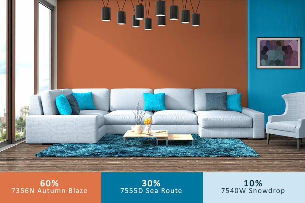
60-30-10 ratio is a time-tested decorating rule which is followed by interior designers. This rule helps you put together a color scheme. The 60 percent is the main color of the indoors or any room like a living room, which will constitute walls, rugs, sofas, etc. The idea behind this is that 60 percent of the color showcases in the space and also serves as the backdrop for other colors.
The 30 percent is the secondary color, which supports the main or primary color. This may include colors for draperies, accent chairs, painted furniture, and bed linens. The remaining 10 percent is the accent color that may be highlighted in decorative accessories, artwork and throw pillows.
Color Palette Generators
The color trends for this year and the coming year includes many types. They include jade, honeyed yellows, lavender, fuchsia pink, green and orange combined, warm beige, dark chocolate brown, deep red, paprika, sunlit yellows with black accents, warm summery tones, rich blues, deep jewel shades, baby pinks paired with teal greens, neutral stone hues, bold-hued furniture and pistachio.
Methodological planning and execution should be your priority. It is best to know and use some color palette generators to know what is working for your space. Color palette generators are probably the next big thing in the color industry. Here are a handful of color palette generators that can help you.
ColorSnap
This was created by Sherwin Williams and helps in building a palette for any room. You can upload a picture as inspiration and in return, you will be able to create a custom color palette. With ColorSnap you can create an account and save the schemes for future usage. This is a fun tool to use for your interior design projects.
Visualize Color
This user-friendly color tool is powered by Glidden Paints. You can either use a sample image or your own photo to start with the project. Visualize Color allows you to virtually paint the room and create a palette that suits your specific needs. You can add color choices to a list and save it offline and then take the same to a local paint supplier.
Color Designer
You can start developing a color scheme on this site and the color picker helps you find a tint and play with the shade. You can also experiment with color harmonies. This is a site that particularly helps web designers but it is also a powerful tool for home decorators.
Coolors.co
This is another tool that can be used by web designers and home decorators. It is an easy-to-use website that allows you to upload an image and then select colors to match the palette of your choice. The moment you are done you can save the palette for future reference and can also adjust color saturation.
Other important color palette generators include Canva, Colormind, ColourLovers, Paletton, Adobe Color and Benjamin Moore’s Personal Color Viewer.


