


They say fashion is cyclic; and so is the world of interior design. Maybe, this is why it is barely a surprise when you see one of these worlds influence constantly the other. Any new color trend in the fashion universe always seems to alter the hot colors of home design including Barbiecore, which is a ‘trend’ making big waves lately.

For the uninitiated, Barbiecore is basically fashion and design inspired by the world Barbie. Yes, you heard it right. That doll many of you played with as a little child is the one currently shaping color choices in homes across the world. Propelled by photos from the sets of Greta Gerwig’s Barbie, Barbiecore has become a style statement in both the fashion and interior decorating realms at warp-speed.

With everything from peach, pastel pinks and rose to bright fuchsia and flamingo, this trend celebrates the color of pink in an unabashed and daring expression. Of course, not everyone wants to live in a world with an overload of pink! And that is why we bring to you today the best and most curated ways in which you can embrace the Barbiecore interior design trend without being drowned in the hue. Step in and discover the power of pink –
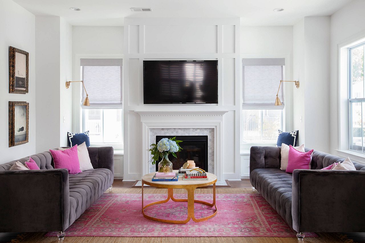
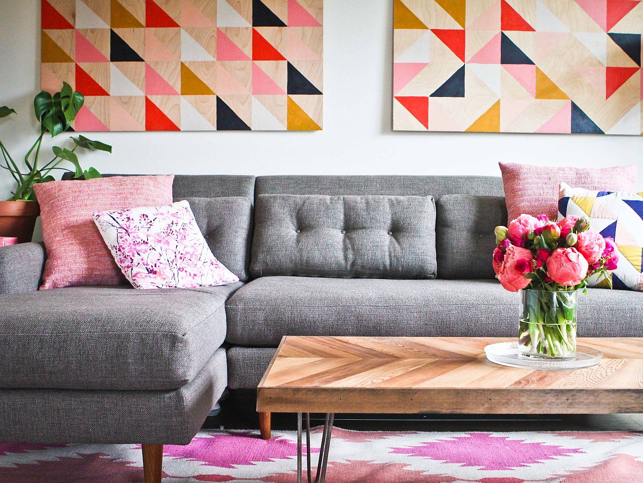
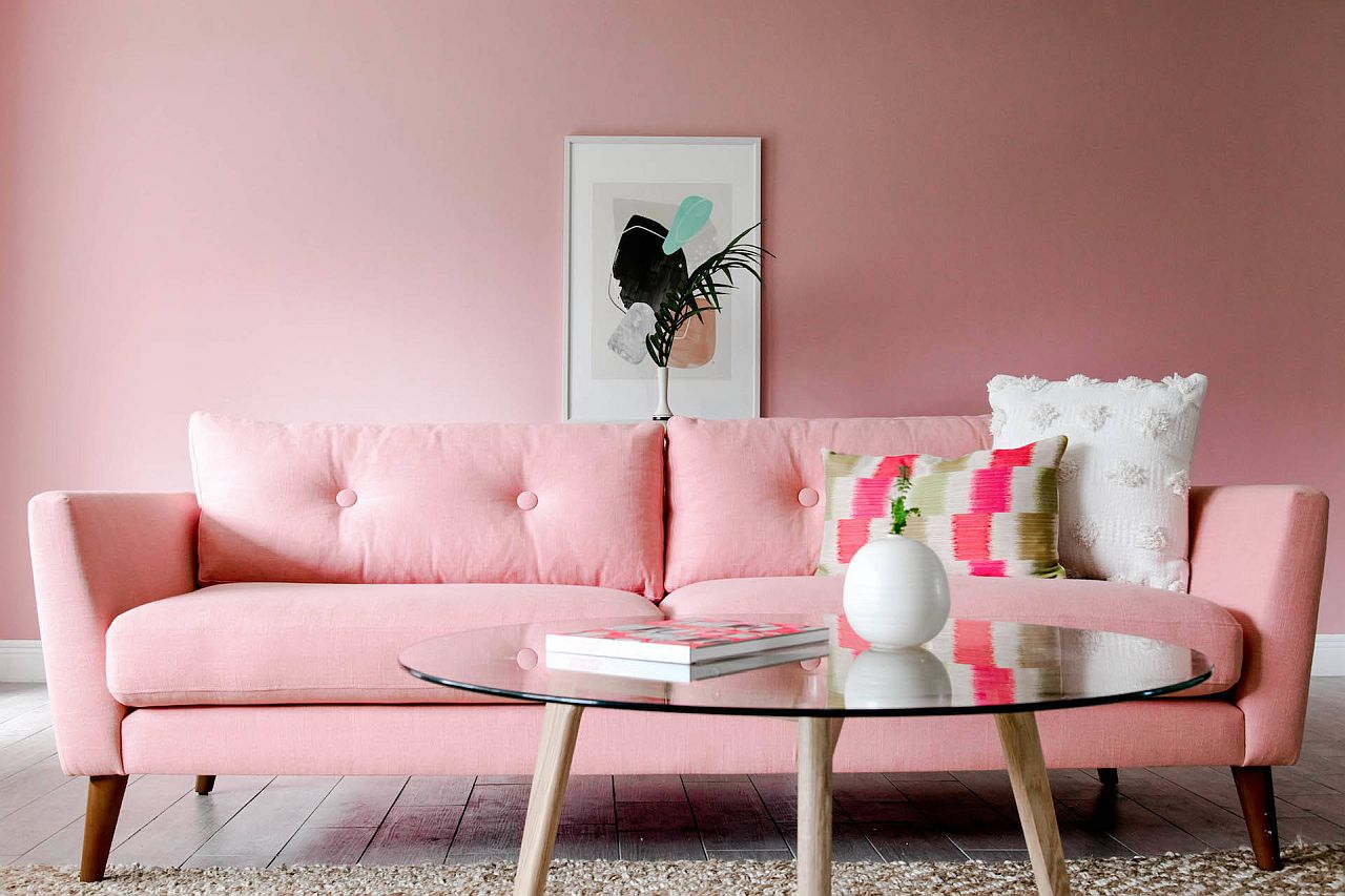
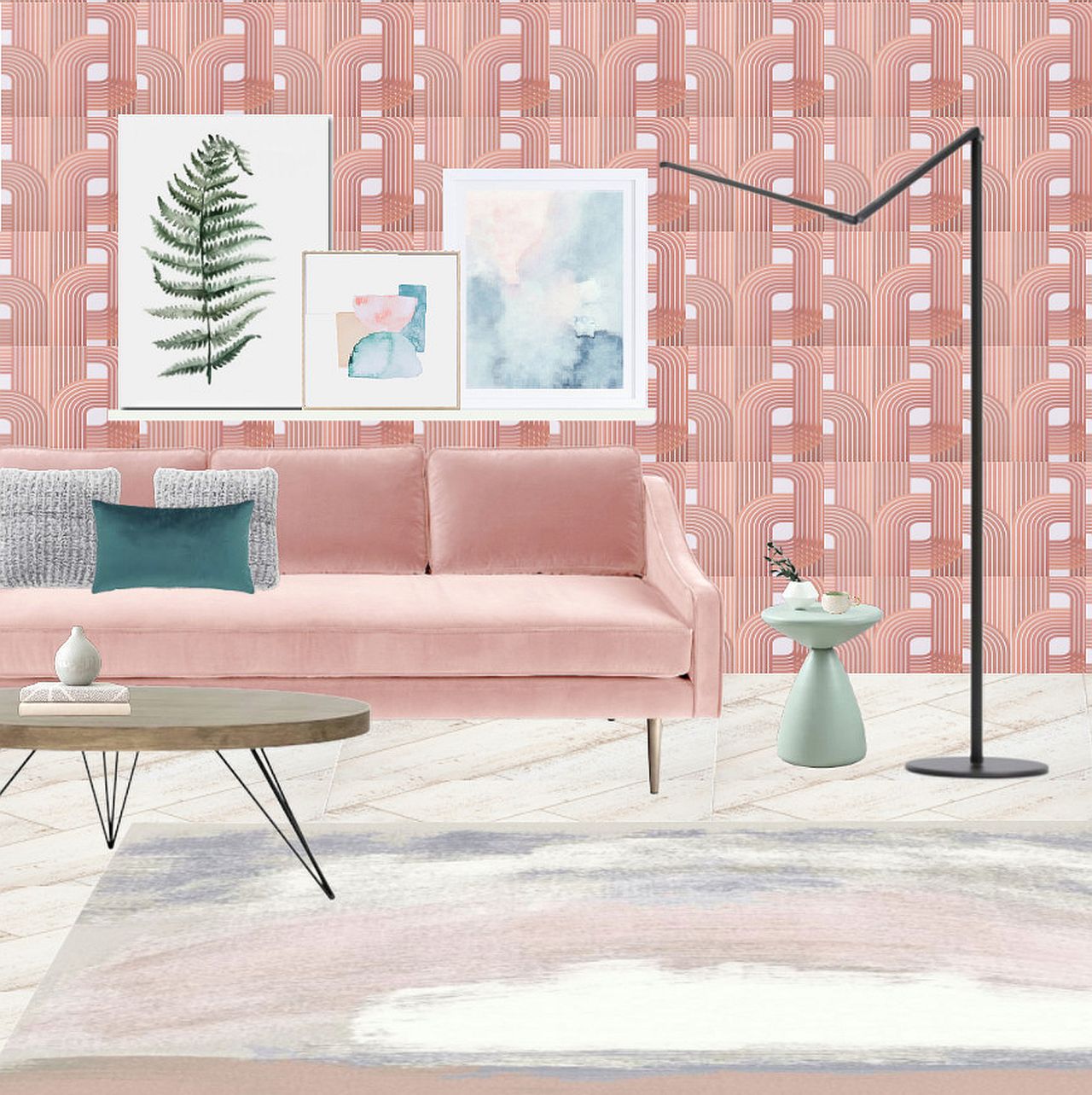
That Amazing Statement Piece
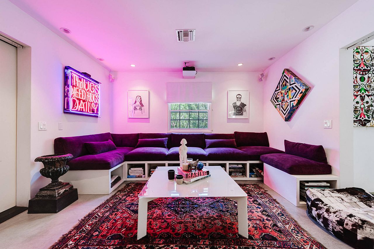
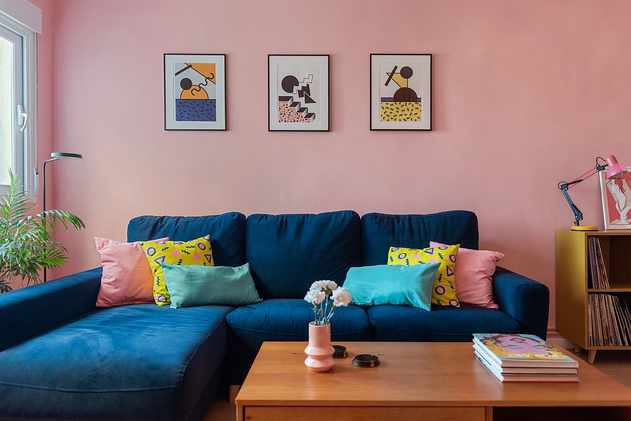
You can start by thinking small, as you go about looking ways in which you can bring pink indoors. In the living space, it is best to first alter the accents around the main pieces to test out the waters. Once you are comfortable with pink in the living space, add a much larger, impressive statement piece in pink. And in the living room, it is the bold pink couch that gets this done without disturbing your chosen style.

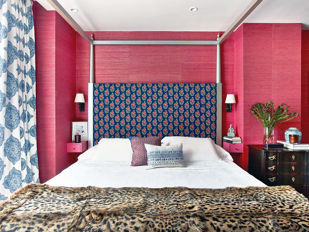
Calming Textures and Textiles
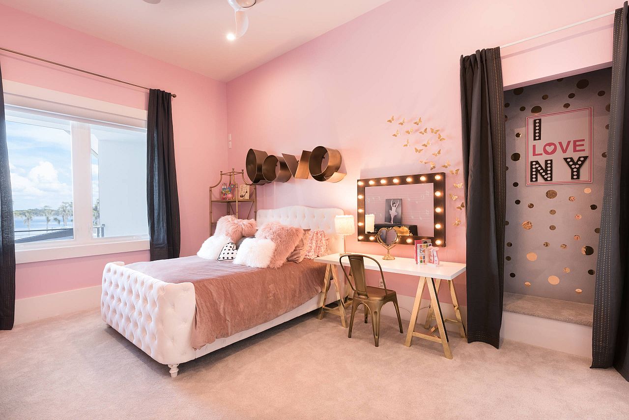
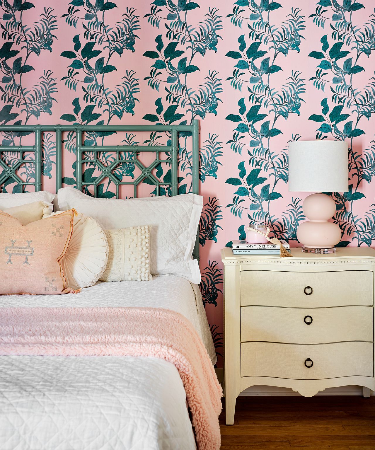
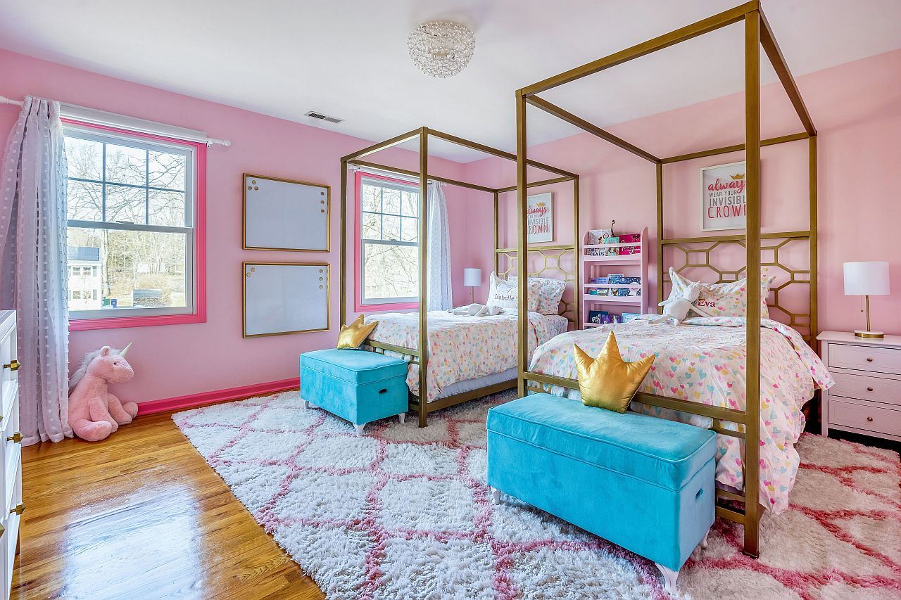
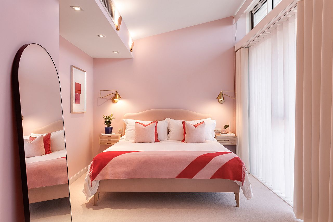
In the bedroom, you have a bit more liberty as you get inspired by Barbiecore and all its pink dazzle. Bedroom is the personal sanctuary where pink works beautifully; especially in the girls’ bedroom with modern, shabby chic, eclectic and midcentury styles. Even in the gender-neutral adult bedroom, a hint of pink using drapes, bedding and pillows can make a grand visual impact. Since, we are using more of pink in here, it is best to stick to pastel and lighter shades and stay away from the likes of fuchsia and hot pink.


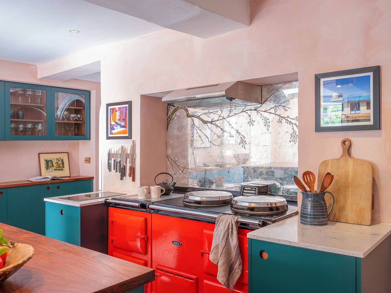
Cooking Up Pink Panache!
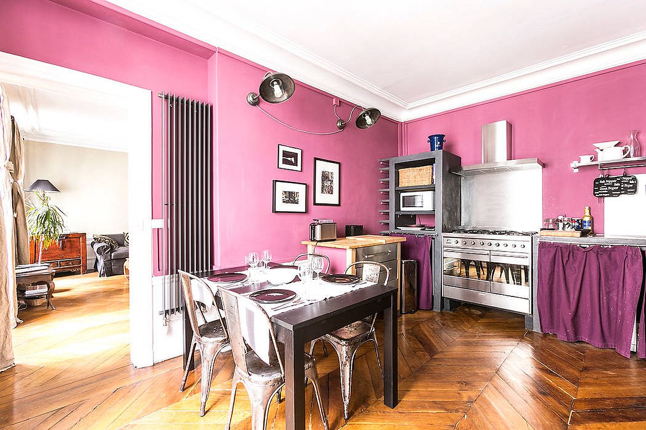
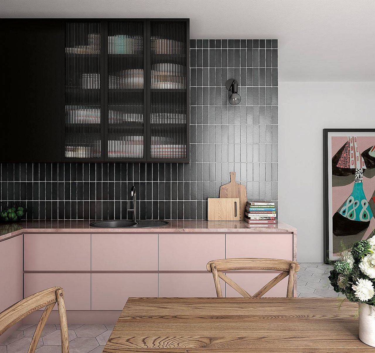
Even before the advent of Barbiecore in recent months, pink in the kitchen has been a trend of sorts in its own inconspicuous way. One of its many beautiful versions sees pink kitchen backsplashes and countertops being paired effortlessly with black to create a balance between the minimal and the daring. Pink backsplashes fill the small kitchen with light and create a sense of spaciousness while subtle pink accents combined with white is best for homes in regions that experience darker and longer winters.

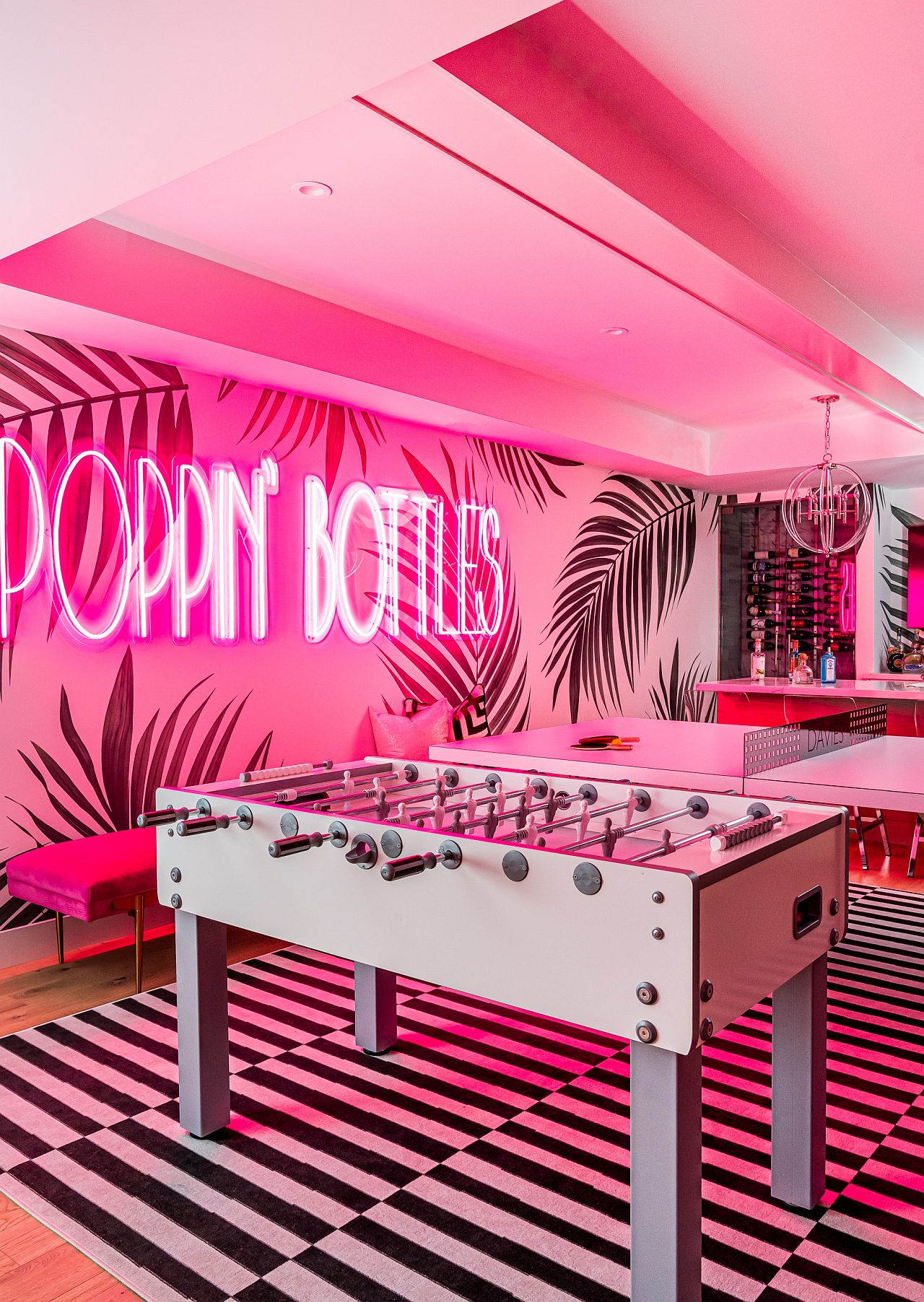
Dazzling Neon Signs
Barbiecore as a trend might be fleeting with interest in it only reaching another short-lived peak with the release of the Barbie movie, but a flashing neon sign in pink on the wall promises to stay relevant much longer! In fact, this is arguably the most ‘Barbiecore’ idea for those looking to dip their toes into the trend without all-pink, all around them. Bright neon signs fit snugly into styles ranging from contemporary to eclectic and industrial and they can be customized to express your personality gleefully.


Also Read: Biophilic Design: A Simple Guide for Green Interior Design Trend
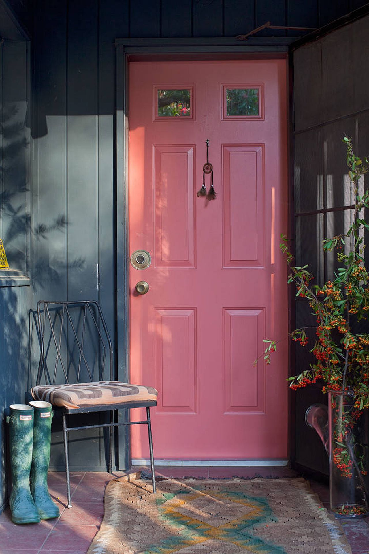
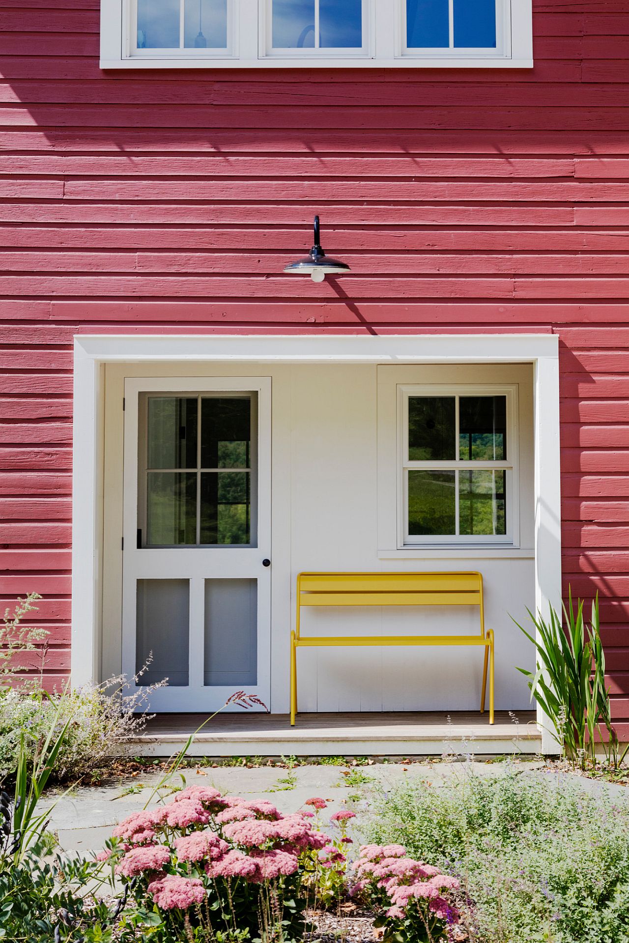
Pink for the Outdoors
Why limit your Barbiecore inspiration indoors? Brightly painted doors that offer a contrast to the more mundane exterior have been around for a moment while colors like blue, orange and green top this list so why not try a bit of pink as you head into fall. Pink doors definitely give your home a façade that is unmistakable and trendy. Smart, elegant and vivacious, this is a great way to enliven the entry without splurging a fortune.


Pairing with Pink
Before having decided to take the plunge into Barbiecore, it is good to have an understanding of what colors work best with it. Black is undoubtedly on top of this list and even a hint of black in a room with pink makes a whole lot of difference. Then you have colors like red and blue that can be used as hues that balance the splurge of pink in the room. Grey, on the other hand, is the leader of the pack when it comes to best neutrals that combine effortlessly with pink.

Finding the Right Pink Hue
Even if you are head-over-heals about the whole Barbiecore trend, it is important to understand that it is not as easy changing the color palette of your room as it is to change your wardrobe. This is why it is best to decide on the shade and tint of pink that you wish to work with before you make other plans. As a general rule, we suggest using lighter hues of the color with matte finish for accent walls in modern interiors. Brighter and bolder splashes of pink only feel compelling in short bursts and in neutral rooms.
Barbiecore or not, a bit of pink is always a great way to spice up your conventional home interior. Of course, with Barbiecore making waves, you have an even bigger reason to try it out right now!


