


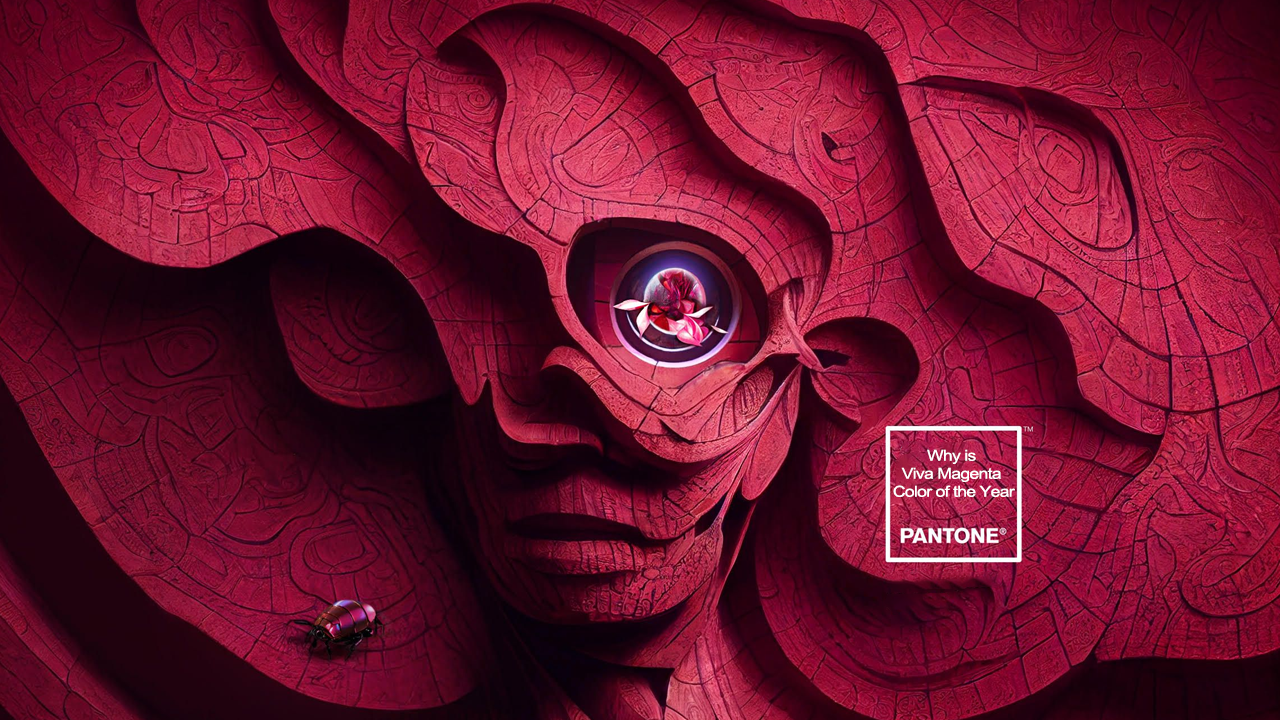
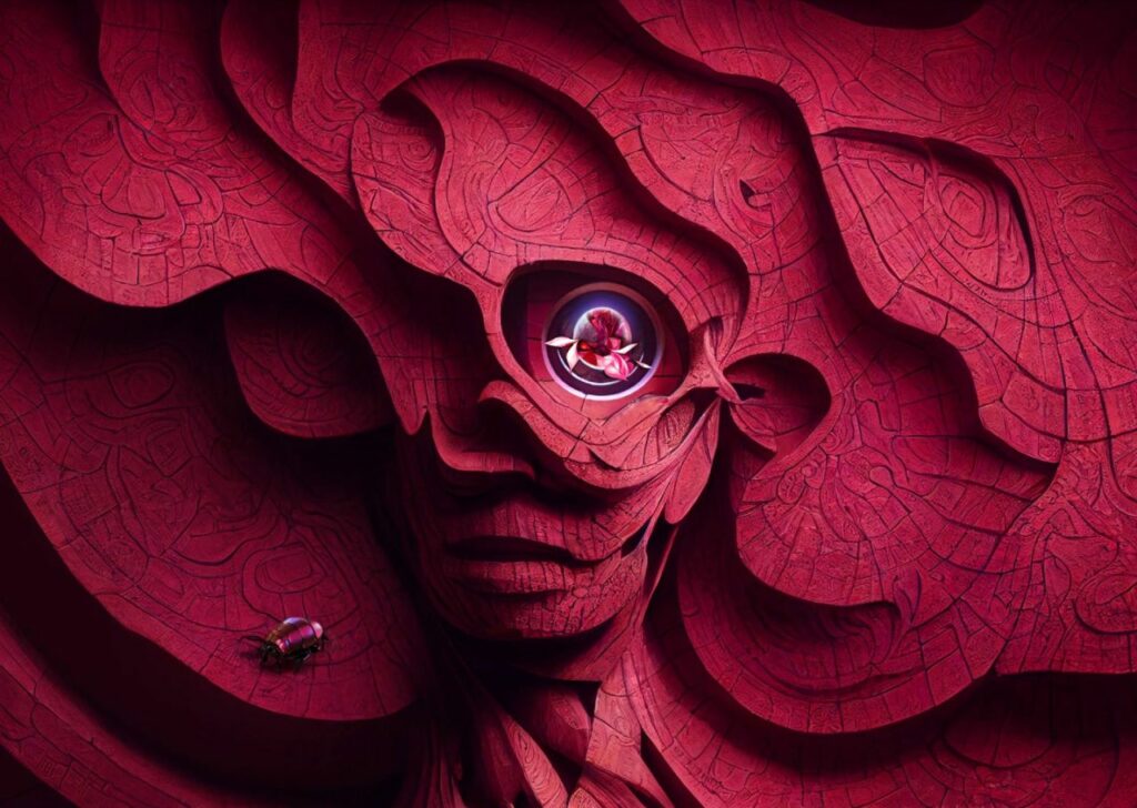
The announcement of Pantone Color of the Year is always a much-awaited event, especially for interior designers and fashionistas. At the end of every year, Pantone labels a hue as the dominating color of the following year. The exclusive Pantone Matching System of the company is used in numerous industries such as painting, graphic design, fashion, and home and interior. In December 2022, Pantone named its Viva Magenta 18-1750 the color of the year.
Given the fact that color is a crucial aspect of human life, it is important to understand why a hue is picked by the color specialist of the global color authority as a dominating shade of the year. While the shade has been announced and is expected to mark its dynamic presence in all spheres of human life, many still do not have a profound idea about what Viva Magenta means and why this peculiarly named color was picked for 2023. To understand, let’s take a dive into the Magentaverse, shall we?
In its official declaration, Pantone says that Viva Magenta 18-1750 is “an unconventional shade for an unconventional time…vibrates with vim and vigor.” This uniquely named color was chosen for it is imbued with strong emotions of bravery, joy and optimism; which frankly all of us need after the tumultuous and fearful years of the pandemic.
What does Viva Magenta Mean?
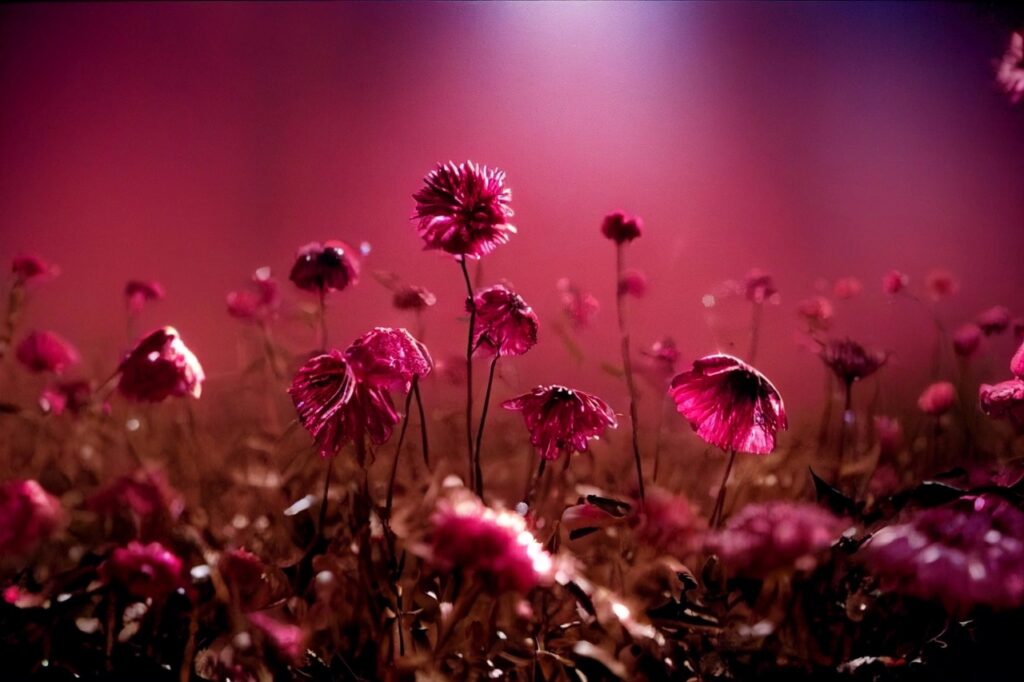
Viva Magenta is inspired by colors present in nature, especially from the cochineal dye. It is a hybrid shade of animated red with pink tones that strikes a balance between warm and cool. Viva Magenta literally translates to “long live, magenta!” Although magenta is not a color that you can often find in nature, it is not exactly an artificial shade either. Viva Magenta was inspired by one of the most precious, rarest, brightest and oldest natural dyes – a red derived from a cochineal, a scale insect.
The importance of color in human life is paramount as colors help us express all kinds of emotions. Elley Chang, Vice President and General Manager, Pantone, said;
It is the connection between color and culture that the Color of the Year Program captures. In color selection every year, we try to hive it represent the attitude, the lifestyles, the dreams present across the world at a given moment in time.
Elley Chang
This unique shade, while descends from the red color family, also leans toward pink. According to color psychology, red is a color of passion, love, vigor, urgency and power, while pink is associated with romance, playfulness, youth and caring. Combined, these two create a hybrid shade that oozes a primordial signal of strength and boldness paired with a playful rebellion. As Pantone said, this color is ‘audacious, full of wit and inclusive of all.’

Why is Viva Magenta Color of the Year?
The company believes that while we are stuck in times of unrest due to a pandemic, a war, an unstable economy, social unrest, and the looming threat of climate change, Viva Magenta is a source of power and bravery that will energize us to face the world head-on. The nuanced crimson red shade is also the tether that keeps us grounded and tied to nature.
Talking to Homecrux about Viva Magenta, Leatrice Eiseman, the Executive Director of Pantone Color Institute, said;
I think it’s going to be a very important color because of the fact that we are in a place now where we acknowledge on a worldwide basis that people are looking for relief from all we’ve been through (referring to the pandemic), we need encouragement, we need to feel braver about the future and red is a color that is widely understood as something that increases empowerment.
Leatrice Eiseman
Interview: Understanding Color With Pantone’s Leatrice Eiseman
The selection process for the Color of the Year candidates involves intense scrutiny of what different aspects of human life are embracing in terms of color and the energy signified through them. In this year’s process, the color company witnessed a sensitivity toward nature through the inclusion of more ‘living things into our homes, like plants, flowers, living walls, and restorative outdoor spaces.’
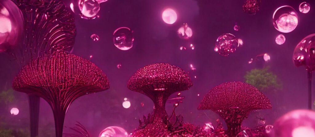
This audacious, nuanced shade of crimson red is going to go places and make a big, vibrant splash in home interiors, fashion and entertainment industry to wash the dullness and dreariness of the past couple of years. You can count us in for the excitement!


With inputs from Atish who interviewed Leatrice Eiseman for Homecrux.


